THE NEW WEBSITE IS LIVE
It is finally done, my new website is live.
I know that it is not 100% complete in all areas in fact I am still working on polishing all the little things over time, but I have decided it was taking too long and I just needed to get it done. So here we are.
A little background on the design
My previous web site design
My old portfolio was simple and effective, big bold typography laid over a modern style design and in all honesty, I loved it.
The major weakness with this design was there was no real information about what I do, just examples of my work. The old gal had gotten me plenty of work but it was time for an upgrade and I was excited, and scared, about having 100% creative control once again.
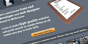
The new and improved design
My new website’s main purpose was to provide more information about who I am and what I do. I wanted to take the elements which made the old design work; strong use of type, strong colours and very simple page structure and apply that overall feel to my new design. Although I did want a completely different style than my previous site.
I started this design in late March and had it, visually, at a stage where I was happy in early April. I kept going back and forth refining more and more elements, simplifying everything and trying to fit as much information in to as little as space as possible and as usual, I worked on it so much I started to dislike it. It was here when I stopped and said, “just shut up and build this damn thing.” So that is exactly what I did.
The bulk of the site was built and running in mid April but was delayed launch for reasons such as a heavy workload, a quick holiday and a general laziness when it comes to writing web content. I could have outsourced it, which probably would’ve resulted in nicer written content, but I wanted to do it myself.
I finished enough of the content earlier today to make it live and decided it was time to get it up and running and I can iron out the little errors as I go.
More marketing improvements
Business Cards
So my websi犀利士
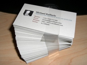
te is done live and what else is there? First off the bat was business cards. My previous business cards were designed to complement my portfolio of the time, as such, I was concerned that if I didn’t update there would be a disconnect when someone visits the new website.
I kind of cheated with this because I had actually designed and printed my business cards at least a few weeks before my site was completed. Bad move, I know, luckily I didn’t feel the need to sway from this design at all.
Social Marketing
I finally set up a Twitter account, I can’t believe I avoided it as long as I did and I have to say that it is a great service. I love following some of my favourite designers/developers and seeing what they are working on.
I will probably be creating a Facebook page sometime soon as another way of providing people with a chance to get in touch.
Linked in is another big thing I need to work on. It is not so much of a big deal in Australia, but is another fantastic tool for networking online… and it’s free too.
The end of this chapter
So that sums up this first post of my new and shiny blog (which I will hopefully use more often). I would love to have some feedback on my design, so please, leave a comment and let me know what works and what doesn’t.
If you are interested in any of my work click here or if you would just love to say hello, either leave a comment below or shoot me a quick email here.


COMMENTS (0)