RESPONSIVE WEBSITE NAVIGATION
What responsive menus are already out there?
There are already a good few posts around highlighting the positives and negatives of the various ways to handle navigation on smaller devices. Good solutions exist already such as converting the menu to a dropdown or the very common ‘toggle menu’ using javascript as used here, here and in an abundance of other websites.
There are also a ton of jQuery plugins that can do it pretty well and automagically but I thought I’d walk through the way I decided to go about it and why.
My approach
For this website I based mine off the toggle menu technique because it was the most common one I came across when considering my approach. The fact is, the approach is so common is for a reason and a sim威而鋼
ple one at that, it works, very well.
The big selling point to me was that I didn’t want to have to output my navigation in a select menu and a list. The drawback to this approach is that it always seemed to require JavaScript to work, which in all fairness is not a big deal anymore, but if I can avoid using JavaScript, I will. There are alternate approaches to this click method such as using the :target pseudo class, but I wasn’t a big fan of that approach because honestly, it didn’t feel right. I know, ridiculous, yet here we are.
For my approach I used a method previously used in my 犀利士
25/css-accordion-no-javascript/” target=”_blank” rel=”noopener”>Pure HTML/CSS3 Accordion article and examples. This is the checkbox and sibling selector method. Its very simple, I have a checkbox that when checked, the sibling (the ul in this case) is made visible and it is as easy as this:
&:checked ~ ul {
	display:block;
}
The Pros
- No separate HTML menu needs to be outputted
- No JavaScript required – all CSS
The Cons
- Will not work for older browsers (IE<9) which is not an issue really as its targeted for mobile devices

With CSS

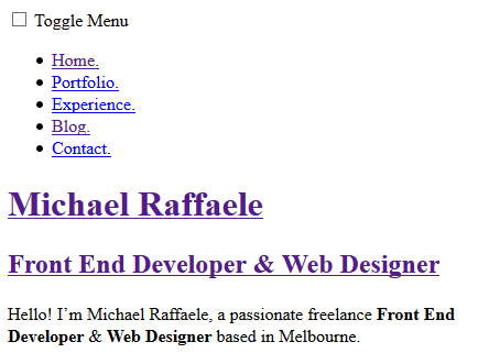
Without CSS
How To Integrate It Into Your Website
The Markup
You need to write the HTML for your navigation. I’ve used a typical unordered list to enclose them in but you can always choose something else:
<ul>
    <li><a href="#">Menu Item</a></li>
    <li><a href="#">Menu Item</a></li>
    <li><a href="#">Menu Item</a></li>
    <li><a href="#">Menu Item</a></li>
</ul>
Then we need to include the label and checkbox to control the actual toggle of the menu. I’ve also enclosed both and the unordered list in the <nav> tag:
<nav>
    <input type="checkbox" id="menu-toggle" />
    <label for="menu-toggle">Toggle Menu</label>
    <ul>
        <li><a href="#">Menu Item</a></li>
        <li><a href="#">Menu Item</a></li>
        <li><a href="#">Menu Item</a></li>
        <li><a href="#">Menu Item</a></li>
    </ul>
</nav>
The CSS
First lets do some simple styling for the navigation and hide the checkbox and navigation by default:
/* Default Styling */
ul {
    display:none;
    overflow:hidden;
}
ul li {
    display:inline-block;
    padding:5px;
}
label {
    background:#238dad;
    color:#fff;
    cursor:pointer;
    display:block;
    padding:5px;
}
input {
    display:none;
}
Finally we need to add the CSS to show the menu when the checkbox is clicked.
/* Default Styling */
ul {
    display:none;
    overflow:hidden;
}
ul li {
    display:inline-block;
    padding:5px;
}
label {
    background:#238dad;
    color:#fff;
    cursor:pointer;
    display:block;
    padding:5px;
}
input {
    display:none;
}

/* Toggle The Visibility */
input:checked ~ label {
    background:#ff8800;
}
input:checked ~ ul {
    display:block;
}
After that all you need to to is enclose it in the media queries so the styles only apply to resolutions you prefer and you’re good to go.

COMMENTS (0)