@font-face vs Cufon
Late last week I was required to explain to print marketing colleagues the differences between using the @font-face css technique and Cufon web font replacement technique.
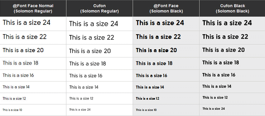
The need for this explanation stemmed from a concern as to whether the chosen font, Solomon, will render clean enough to use across the new website at a range of differing font sizes.
I just thought I would simply share this email (which has been slightly modified for this post) which I sent in an attempt to help explain the differences between the two. The email was sent along with the following examples to enable them to visually compare the differences and choose which version (if any) they would go ahead with.
The Email:
@font-face Method
So the first option uses a CSS method called @font-face. This is the modern way of embedding fonts in webpages and works very well. It is quite fast and entirely selectable but it relies on the users computer to anti alias the font. Therefore if anti aliasing (or Cleartype, on Windows) is disabled then there is no smoothing at all. Most computers have it on these days, just some older machines using Windows XP might not.
In regards to the browser support for @font-face, fonts can be loaded in all browsers back to and including, Internet Explorer 6. To ensure compatibility across all browsers we need to convert the font to a range of different formats including OTF, TTF, EOT, WOFF and SVG. (I think that is all of them). So the file size will jump up a little bit, but ultimately that is not a major issue as the user will only download these once and they will be stored in cache. This is easy to do though.
The issue with the @font-face method, for Soloman anyways, is that when the font size drop below approx 14-16px it seems to lose clarity and becomes a little blurry as you can see in my example below.
Javascript (Cufon) Text Replacement Method
This option uses a javascript font replacement model called Cufon. Instead of embedding the fonts as if it was a standard font in the webpage (@font-face) we basically take the current text and generate images from them on the fly (using the type of choice). The fonts also have to be converted in this method, but this time to Javascript. The benefit to this method is that the font will be automatically anti aliased as part of the image generation, but the downside is as the text is now images they will not be selectable. (Or not properly anyways.)
Another issue with this is that there may potentially be a slight delay where the normal text is visible while the images are being generated and loaded. It is more or less a quick flash as it updates, but a slow down none the less. Obviously the more titles that use this font on the page, the more images you have to generate.
Summary
The main difference between the two is Option 1 is faster, cleaner code and basically the standard (and looks like it will remain in the near future) for using Type on the web. Option 2 however, is generally nicer looking on all systems and varying font sizes (due to built in anti aliasing) but is slower to load. Method 2 was generally used before @font-face was so widely accepted.
The "Real" Summary
Hopefully this email can help anyone who is unsure which path to go down or at the very least provide a little information as to the benefits and/or differences between the two.
So, based off the example website and my little email above, which method could you see yourself choosing and why?